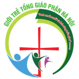
Unveiling the logo of the 23rd Hanoi Provincial Youth Congress – 2027

The 23rd Hanoi Provincial Youth Congress will be hosted by the Archdiocese of Hanoi in 2027 – theme: “Go and make disciples of all nations” (Mt 28:19).
The logo of the 23rd Hanoi Provincial Youth Congress has been officially unveiled. The Congress will be hosted by the Archdiocese of Hanoi in 2027, with the theme “Go and make disciples of all nations” (Mt 28:19).
2027 also marks 400 years since Father Alexandre de Rhodes set foot in Tonkin (1627–2027). Below is the meaning of each element of the logo.
1. The Cross – Christ at the centre
The red Cross stands at the centre and rises upward: Christ is the centre of young people’s lives and the foundation of the Hanoi Provincial Youth Congress.
The Cross does not stand apart but rises out of the whole map, expressing young people rooted in the life of the Church — in their own homeland, diocese and community — and turned towards Christ.
The Cross also sits inside a location-pin shape, which can be read as a sign marking Hanoi — the host of the Congress and the meeting point of young people from every diocese of the province.
2. The whole – An image of the northern Ecclesiastical Province
The coloured bands are stylised from the map of the northern Ecclesiastical Province, yet they do not trace it rigidly: they become soft, continuous, flowing ribbons of silk.
A single ribbon links every region: though they come from different dioceses, villages and communities, young people are united as one in the one Christ and the one Church.
The ribbon also gives a sense of moving forward, in keeping with the spirit of a Youth Congress.
3. The ribbons – Young people setting out
The curves stand not only for geography: they can also be read as the footsteps, roads and journeys of young people.
The unbroken form expresses a young generation that is gathered – connected – deepened in faith – and sent out.
The upward movement of the ribbons feels young, dynamic and full of life: a young Church that does not stand still but always moves forward.
4. A flower-shaped Cross
What is special about the Cross — the heart of the logo and of the whole visual identity of this Congress — is its soft, rounded strokes instead of sharp, rigid angles, like four petals opening out.
The flower-shaped Cross expresses the Catholic faith blossoming on Vietnamese soil — beginning with the ship of Father Alexandre de Rhodes long ago, and watered by the blood of the Vietnamese Martyrs.
5. Three main colours – Three dimensions of the journey
Red – the fire of faith and the zeal of youth: the most striking colour in the logo, linked to fire, love and the sacrifice of Christ. It also stands for the energy, vitality and longing for commitment of young people.
Yellow evokes light, joy and glory, with a special meaning because the Congress takes place in 2027 — 400 years since Father Alexandre de Rhodes arrived in Tonkin (1627–2027): 400 years of the light of the Gospel being sown, taking root and being handed on to young people today.
Blue – hope, the open sea and mission: blue evokes the sky and the sea, symbolising hope, openness and new horizons. Above all it recalls the call to put out into the deep — stepping out of safety to bring the Gospel to the peripheries and to the world.